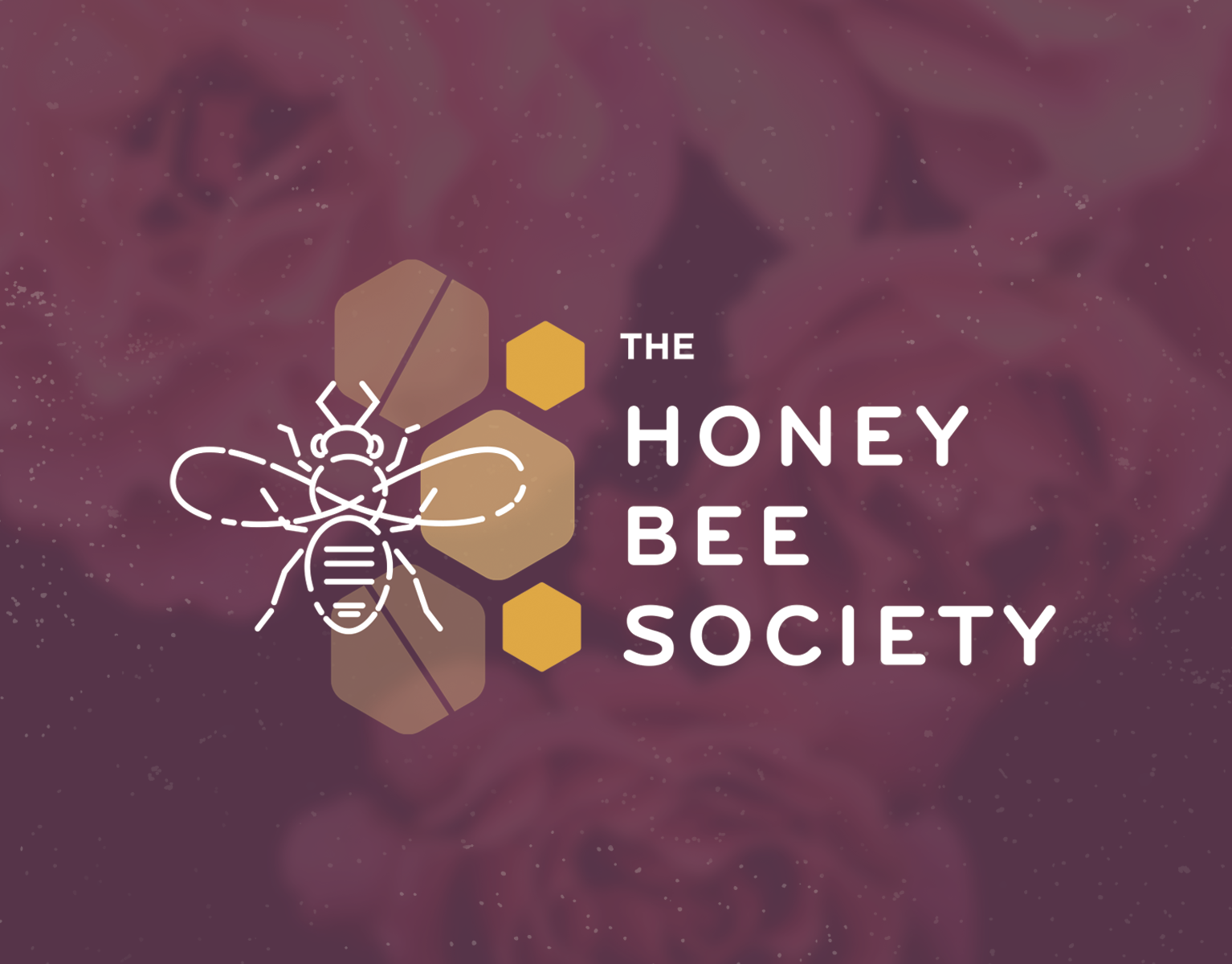
Challenge
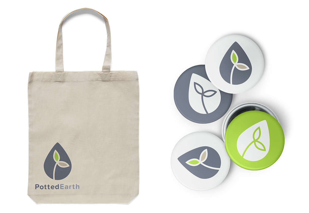
Potted Earth, a Portland-based cannabis grower, faced the challenge of distinguishing itself in a crowded market saturated with marijuana products. They wanted their visual branding to reflect their mission of community engagement and offer an alternative to the stereotypical cannabis imagery commonly found on the shelves.
Potted Earth, a Portland-based cannabis grower, faced the challenge of distinguishing itself in a crowded market saturated with marijuana products. They wanted their visual branding to reflect their mission of community engagement and offer an alternative to the stereotypical cannabis imagery commonly found on the shelves.
Solution
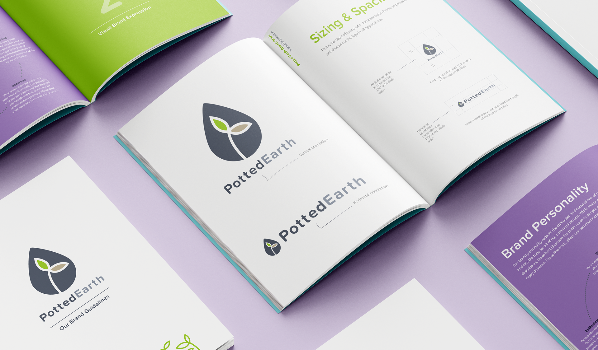
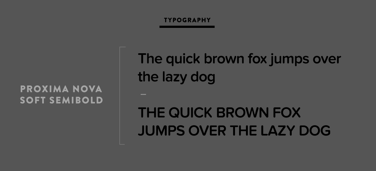
I crafted a visual brand that subtly hinted at cannabis while emphasizing an all-natural, community-oriented product. I opted for simple typography and warm, approachable colors that conveyed a welcoming and inclusive vibe. This strategy was aimed at inviting a diverse audience to engage with Potted Earth, setting them apart from the typical cannabis branding clutter. The final solution successfully aligned with their mission, ensuring their branding communicated both their product's nature and their commitment to the community.
I crafted a visual brand that subtly hinted at cannabis while emphasizing an all-natural, community-oriented product. I opted for simple typography and warm, approachable colors that conveyed a welcoming and inclusive vibe. This strategy was aimed at inviting a diverse audience to engage with Potted Earth, setting them apart from the typical cannabis branding clutter. The final solution successfully aligned with their mission, ensuring their branding communicated both their product's nature and their commitment to the community.
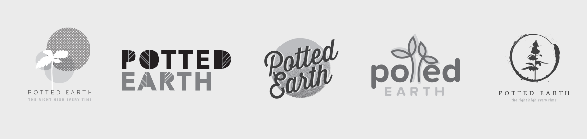
Initial Concepts
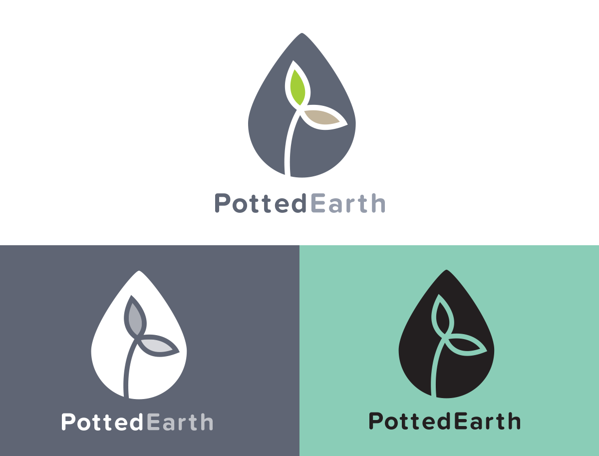
Final Design


Application