
Challenge
NWEA needed to be seen as a single organization that partners across the system to provide solutions that address the challenges of educators and leaders at every level. The opportunity arose to leverage the core attributes of NWEA to present a cohesive brand experience that brings its products and services together as solutions, under one visual language for NWEA.
NWEA needed to be seen as a single organization that partners across the system to provide solutions that address the challenges of educators and leaders at every level. The opportunity arose to leverage the core attributes of NWEA to present a cohesive brand experience that brings its products and services together as solutions, under one visual language for NWEA.
Solution
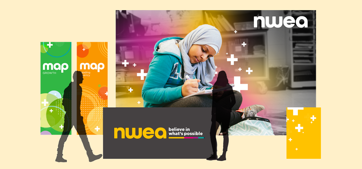
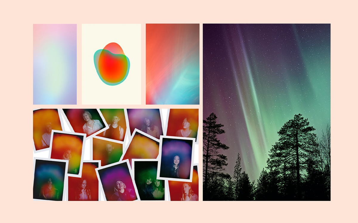
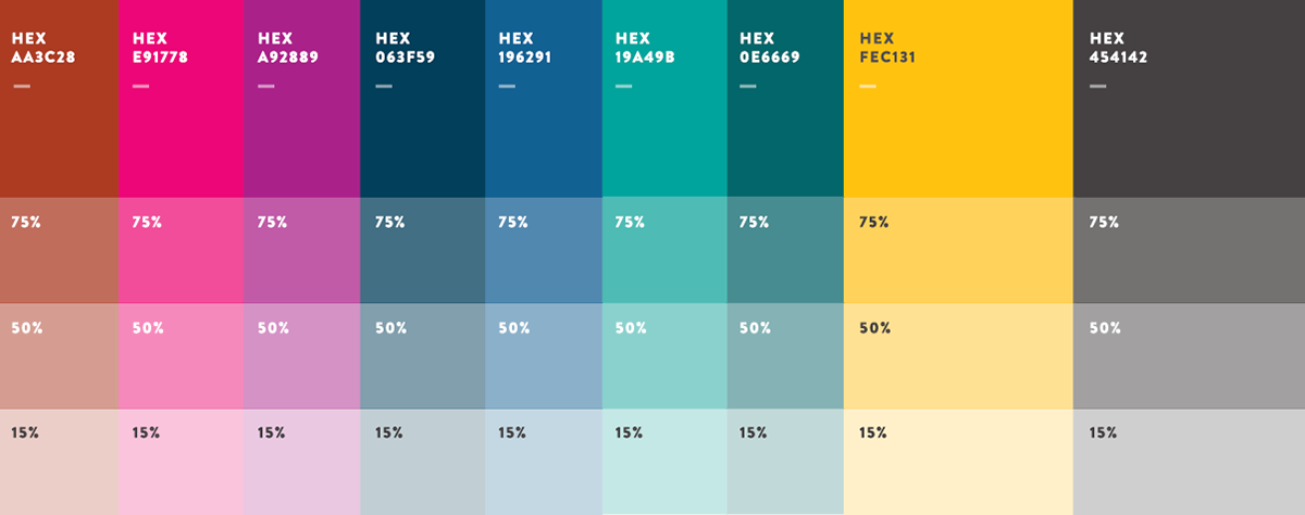
As we moved into a solutions-based space where partners are given tailored experiences, we wanted a visual language that reflected each individual's uniqueness. Our visuals tie closely to the Aurora Borealis - a vivid, natural light display. We were drawn to the inspiring phenomena, and how it pulls together color and gradients in a complex and ever-changing way. In order to serve the needs of teams across the org, we needed to expand upon the NWEA color palette. Not only did we add three darker colors to our primary palette but created a secondary palette to assist in the creation of supporting graphics and images. We additionally identified three additional shades of each color to assist with making touchpoints for both AA and AAA levels of accessibility.
As we moved into a solutions-based space where partners are given tailored experiences, we wanted a visual language that reflected each individual's uniqueness. Our visuals tie closely to the Aurora Borealis - a vivid, natural light display. We were drawn to the inspiring phenomena, and how it pulls together color and gradients in a complex and ever-changing way. In order to serve the needs of teams across the org, we needed to expand upon the NWEA color palette. Not only did we add three darker colors to our primary palette but created a secondary palette to assist in the creation of supporting graphics and images. We additionally identified three additional shades of each color to assist with making touchpoints for both AA and AAA levels of accessibility.
Team
ART DIRECTOR: Yosh White | SR. CONTENT WRITER: Erin Ryan | SR. DIRECTOR OF BRAND: Kyle Sheaffer | ANIMATOR & GRAPHIC DESIGNER: Amy Meyer | CREATIVE DIRECTOR FOR CONTENT & SOCIAL: Joe Gallagher | SR. MARKETING MANAGER: Megan Akers | PROJECT MANAGEMENT: Kristi Swearingen & Meighan Holder | WEBSITE OPERATIONS: Tiffani LeClair & Taylor Riordan
ART DIRECTOR: Yosh White | SR. CONTENT WRITER: Erin Ryan | SR. DIRECTOR OF BRAND: Kyle Sheaffer | ANIMATOR & GRAPHIC DESIGNER: Amy Meyer | CREATIVE DIRECTOR FOR CONTENT & SOCIAL: Joe Gallagher | SR. MARKETING MANAGER: Megan Akers | PROJECT MANAGEMENT: Kristi Swearingen & Meighan Holder | WEBSITE OPERATIONS: Tiffani LeClair & Taylor Riordan
Inspiration
Applications
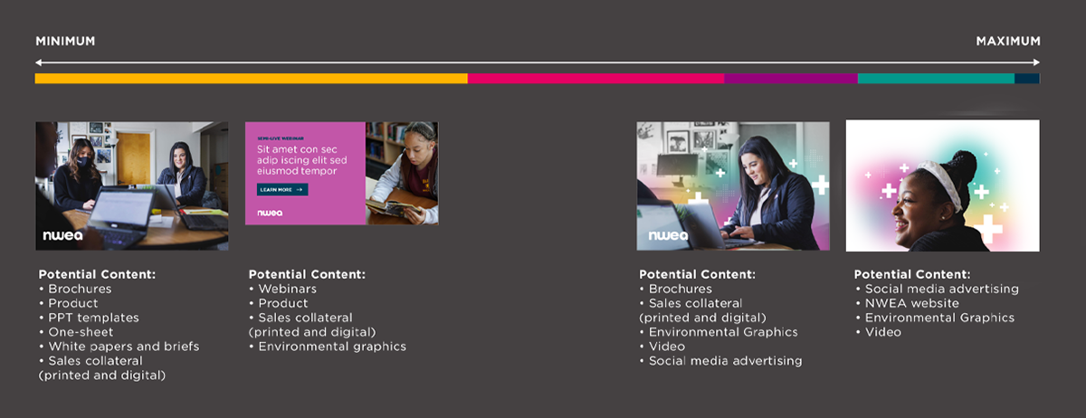
Brand elements live on a continuum of use, from minimum to maximum amounts of application. Below is a high-level overview of how to use the brand in different formats along with examples. Most evergreen content will have minimal branding whereas our ever-changing social will use the most expressive form of our visuals.