Challenge
Geranium Lake Flowers, a well-established floral business located at the base of the U.S. Bank tower, faced a branding challenge. After 20 years in operation, the owner recognized the need for a brand refresh to better align with contemporary aesthetics and customer expectations. The existing branding may not have conveyed the desired vintage look and feel, which was essential to capture a specific ambiance.
Geranium Lake Flowers, a well-established floral business located at the base of the U.S. Bank tower, faced a branding challenge. After 20 years in operation, the owner recognized the need for a brand refresh to better align with contemporary aesthetics and customer expectations. The existing branding may not have conveyed the desired vintage look and feel, which was essential to capture a specific ambiance.
Solution
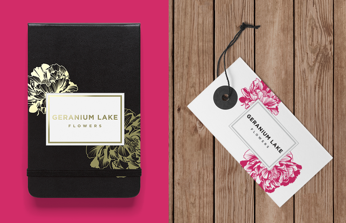
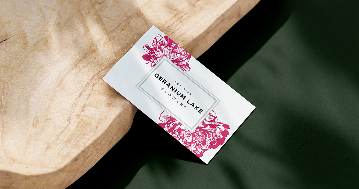
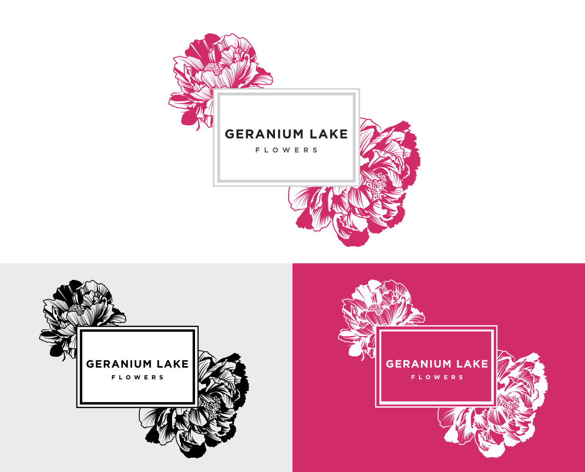
The final logo design incorporated detailed peonies, a classic and timeless floral element, which perfectly aligned with the vintage aesthetic sought by the owner. This design was combined with a clean box and a thoughtfully chosen typeface to create a harmonious balance between the vintage and modern aspects of the brand.
The final logo design incorporated detailed peonies, a classic and timeless floral element, which perfectly aligned with the vintage aesthetic sought by the owner. This design was combined with a clean box and a thoughtfully chosen typeface to create a harmonious balance between the vintage and modern aspects of the brand.
Importantly, the floral component of the logo could be used independently or alongside the wordmark, offering flexibility in its application based on the client's specific needs. The overall effect of the logo successfully evoked a feeling of natural beauty, simplicity, and professionalism. It conveyed the message that Geranium Lake Flowers specializes in high-quality and stylish floral arrangements, using geraniums as a signature flower to symbolize dedication to excellence and customer satisfaction.
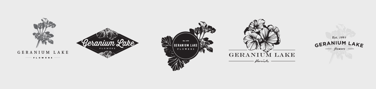
Initial Concepts
Final Design

Application